Lowe's Home Improvement
Digital | UX Design
Designing an Augmented Reality feature for the
Lowe’s Consumer App
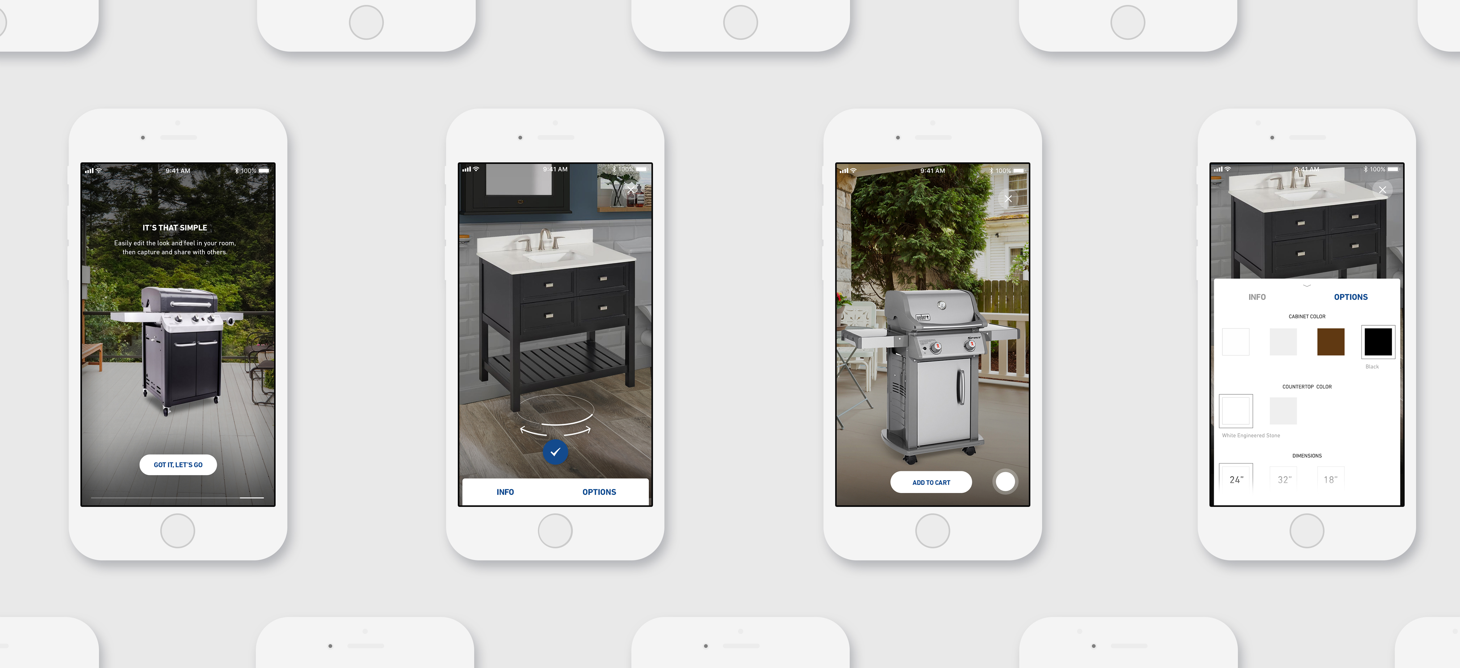
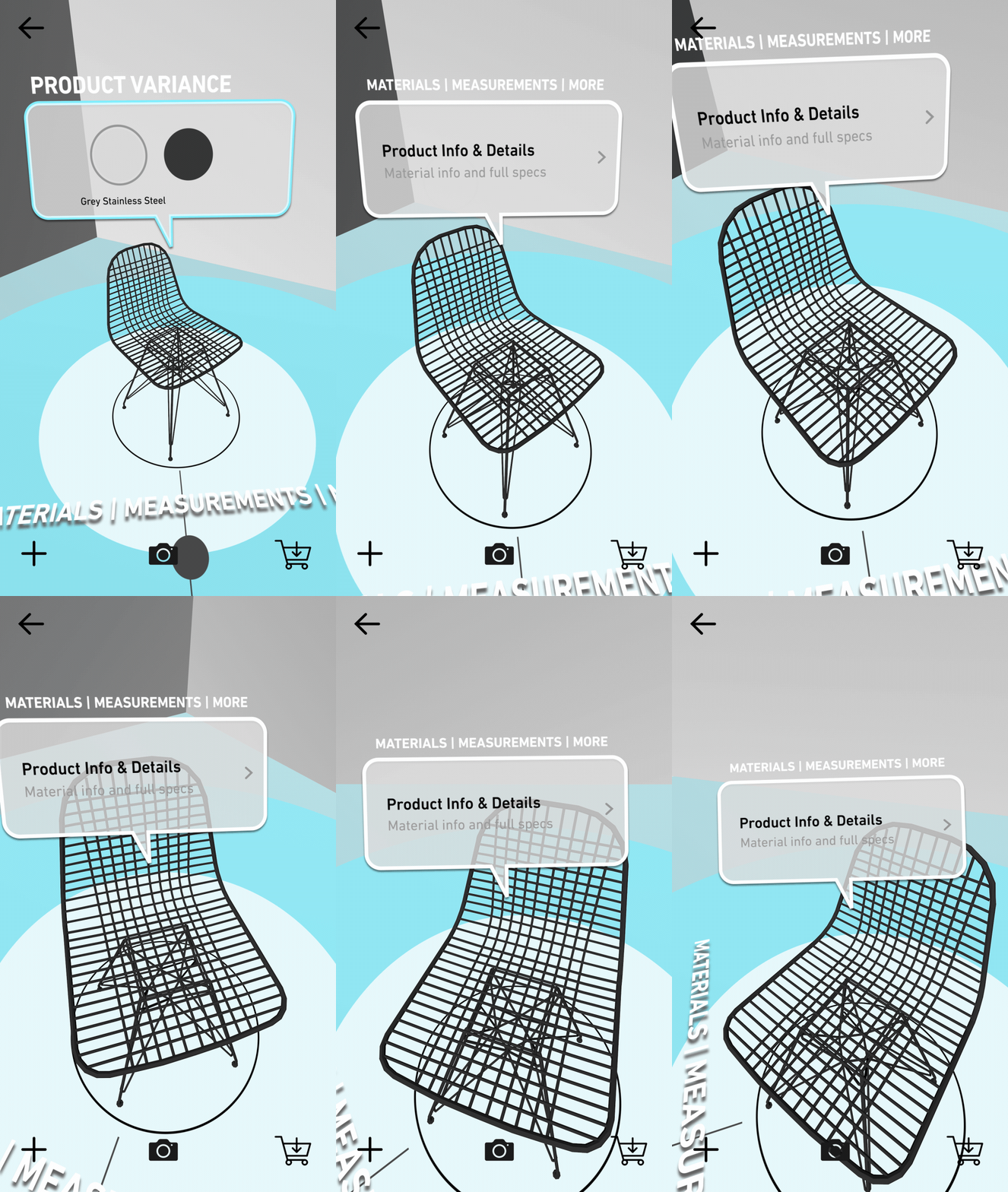
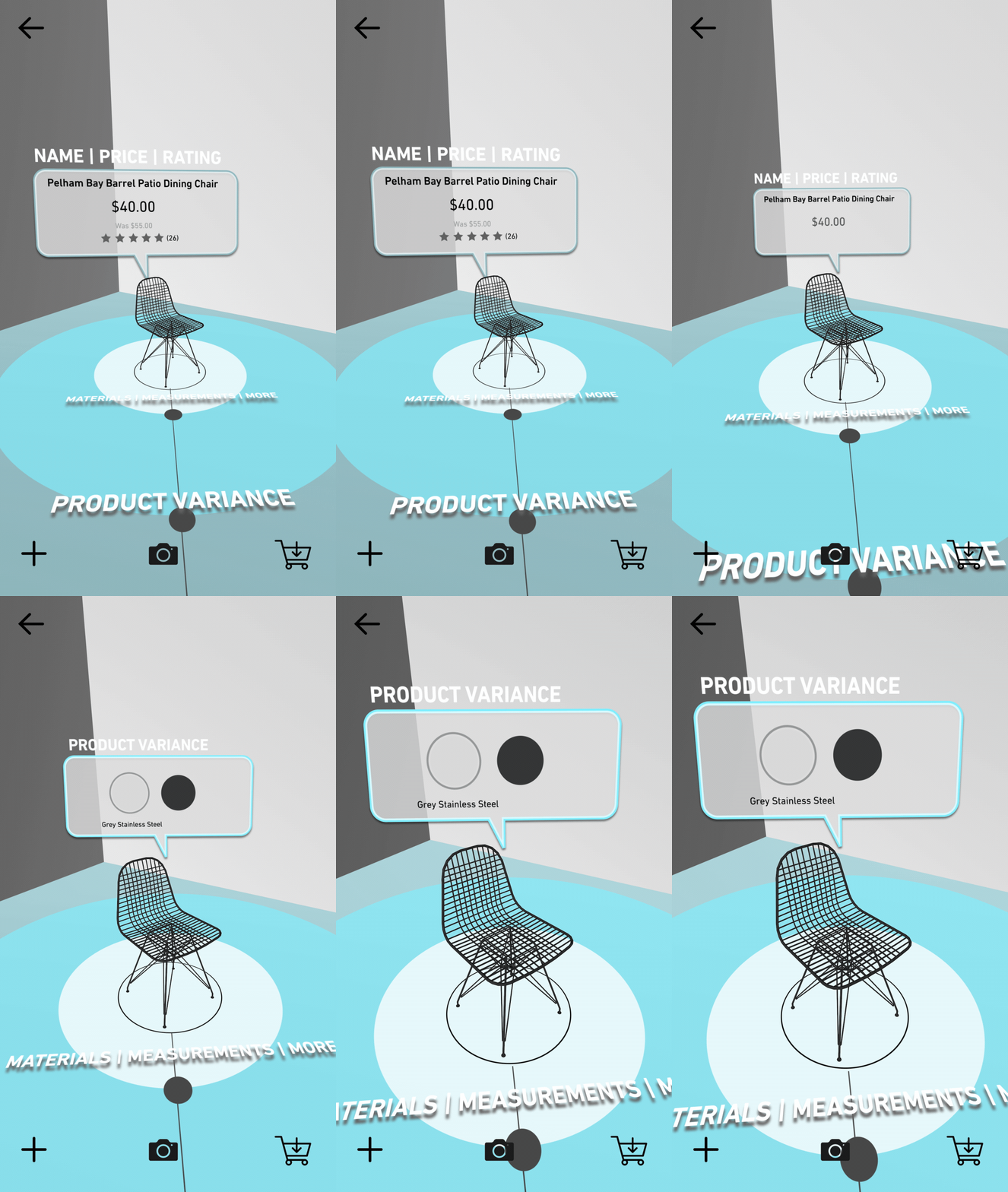
As part of our ongoing retainer work with the Lowe’s Consumer App, they asked us to design an Augmented Reality product visualizing experience for their current app. As AR is a new technology we had an extended exploratory/play period. To get into the mindset of ‘AR’ and move beyond static and flat wireframes, I played around with a model chair, quickly taking photographs with my phone.
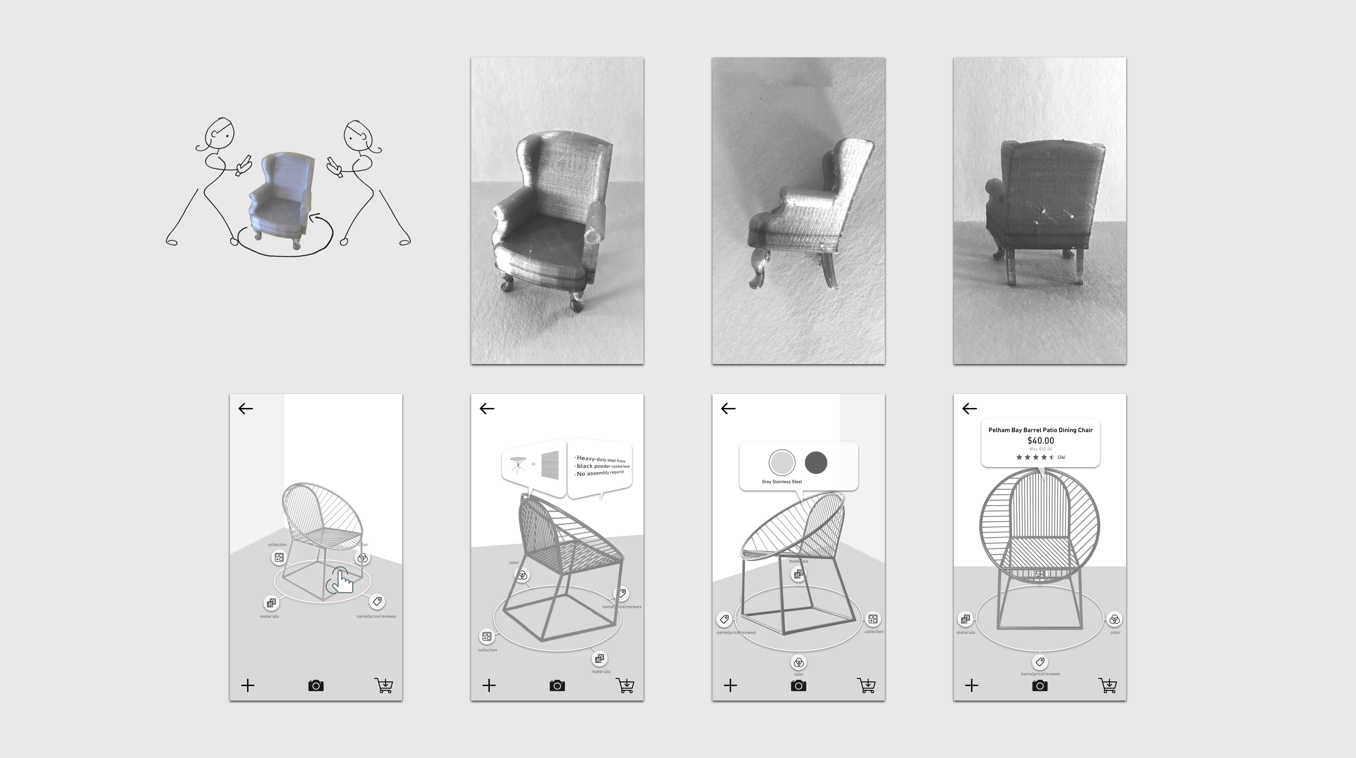
Concept 1.
Rotation/Angle
I took the natural interaction of people moving around objects of interest to closely examine it for details and applied it to AR. As users either rotate the object on the screen or move around it in space, new details would emerge that would help the user with their decision making process.
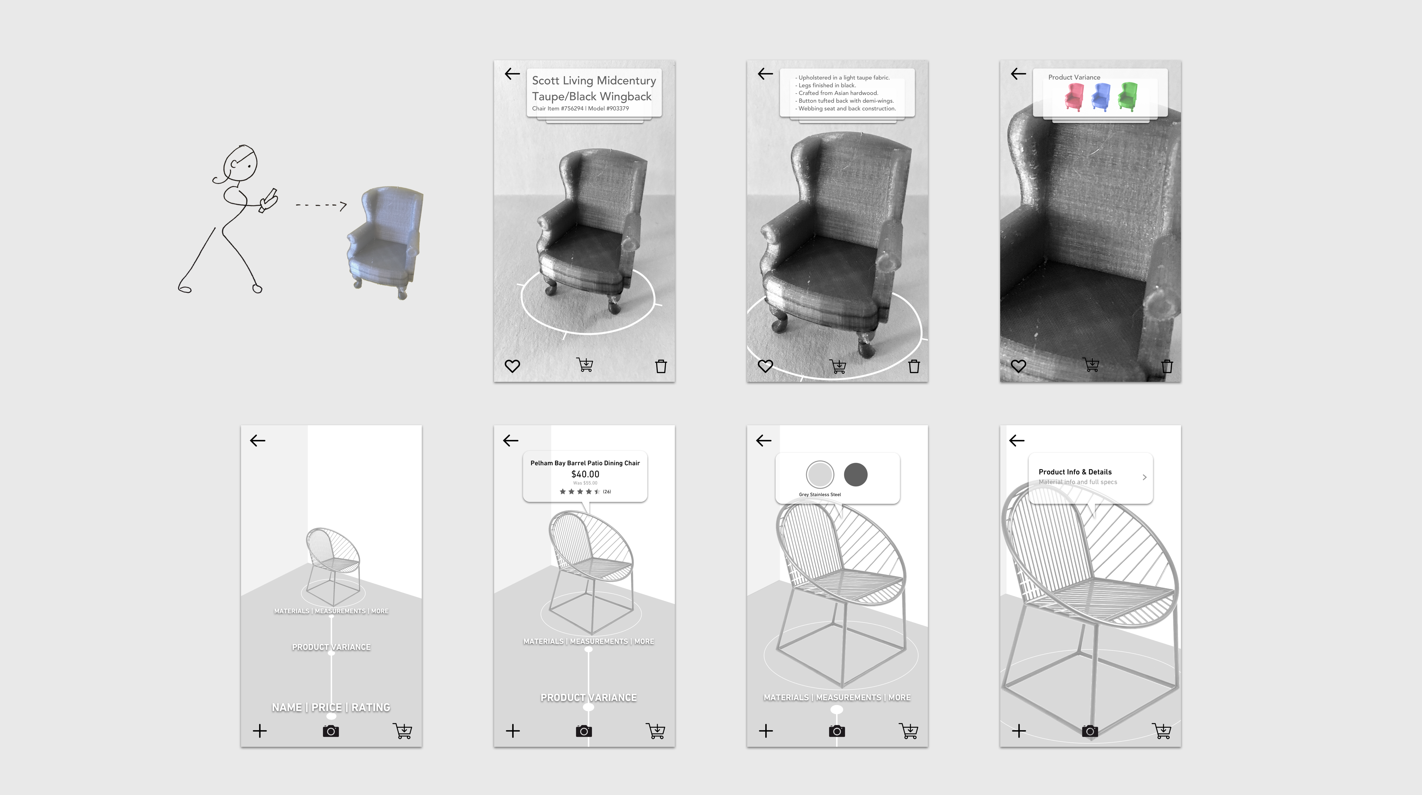
Concept 2.
Distance
When interacting with a physical object, users move closer to an object they are interested in when they shop. Using this idea, revealing new information as the user draws closer to an object simultaneously rewards the user for express interest while drawing them in even further.
A motion graphics study revealed many interesting tactical design elements that should be considered when designing for AR as opposed to a static screen experience.
Learnings
1. While AR interactions should be intuitive, don’t be afraid of allowing the user to play and discover.
2. Eliminate screen clutter and use text sparingly in the AR environment.
3. Large swaths of color are better for delineating spatial differences then lines or text.
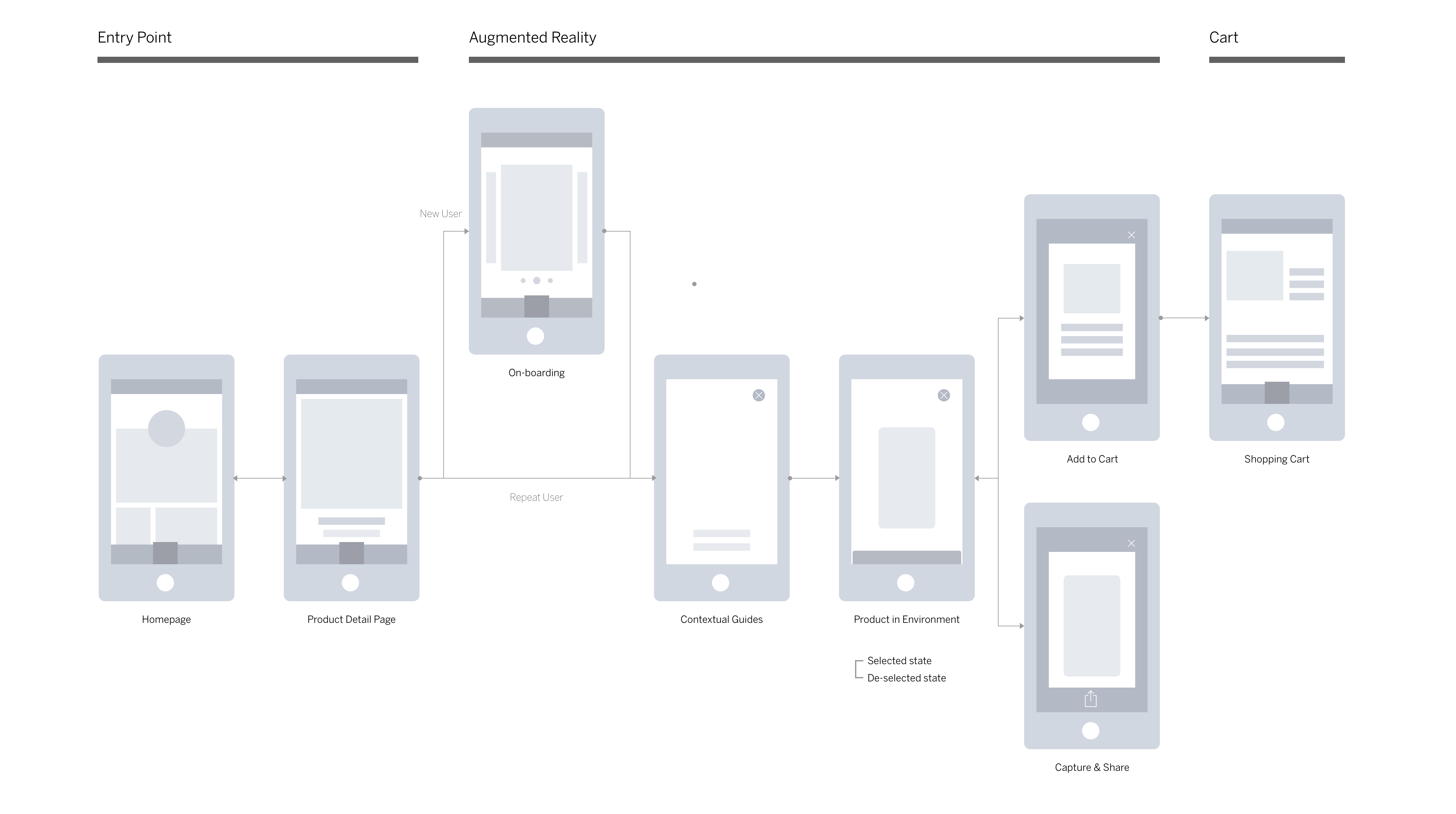
User Flow
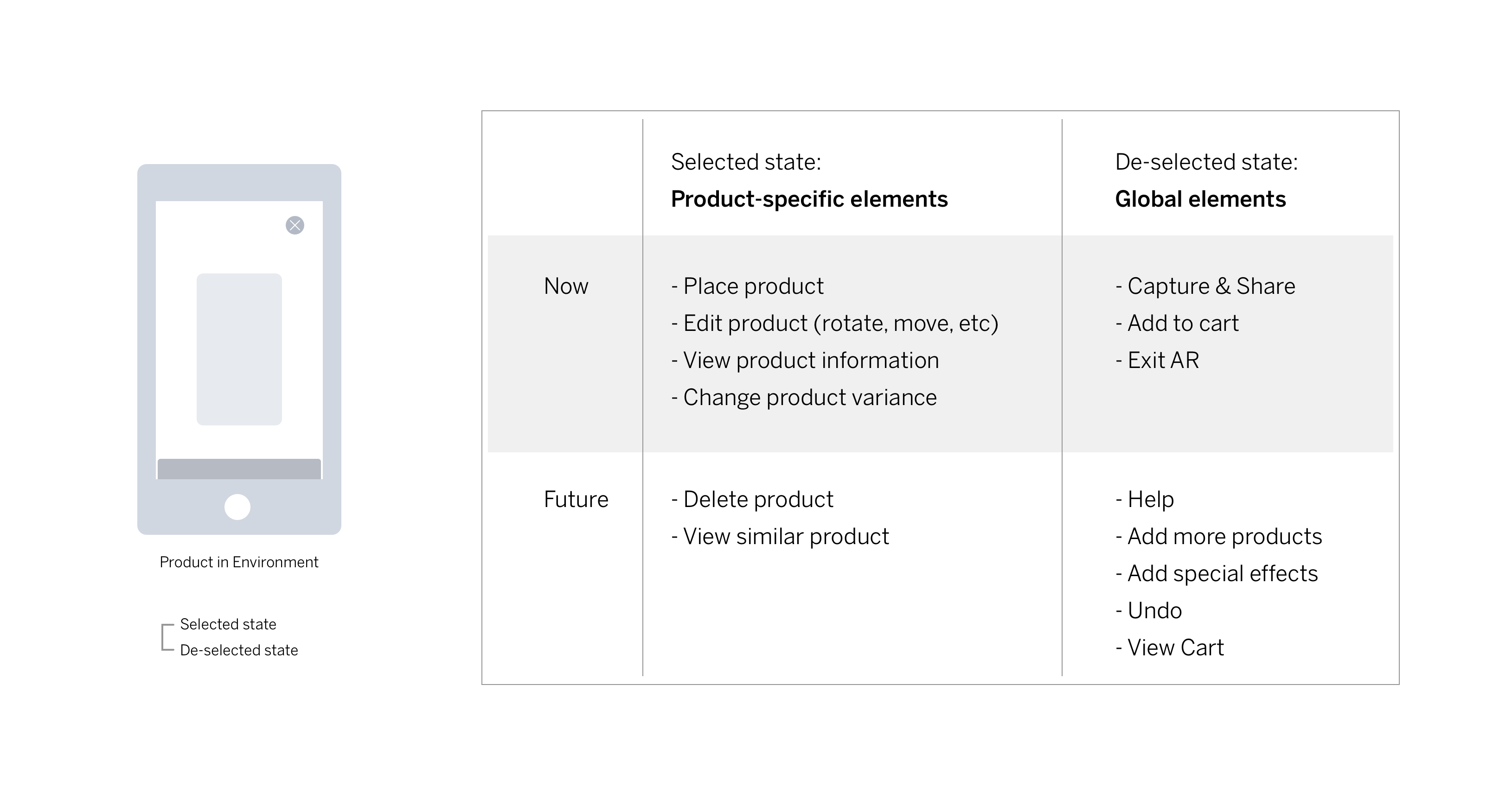
Feature List
Wireframes

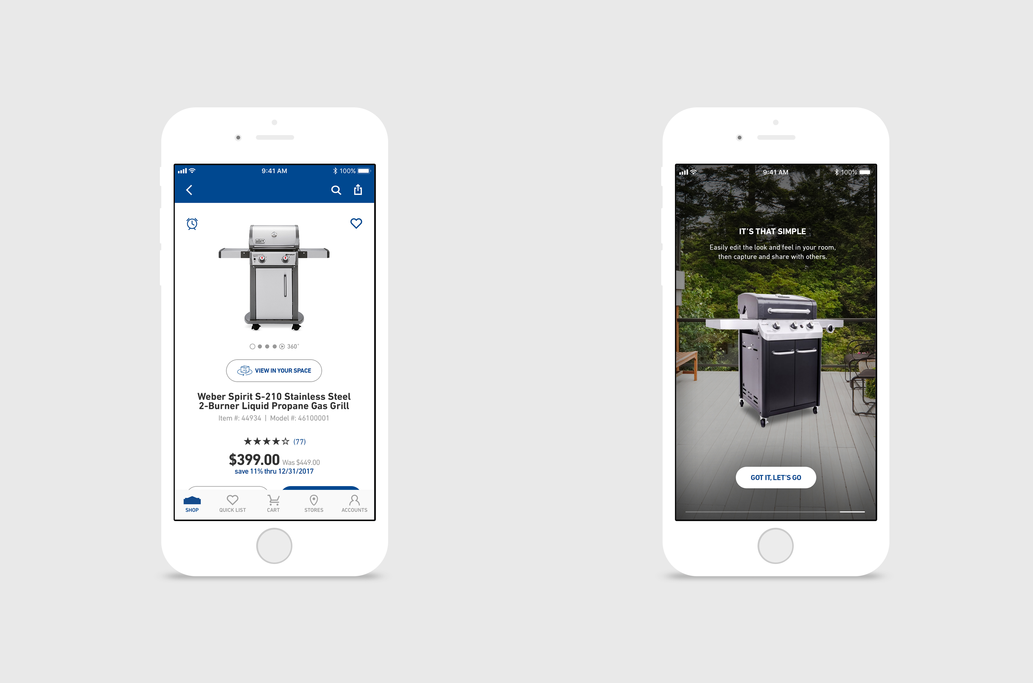
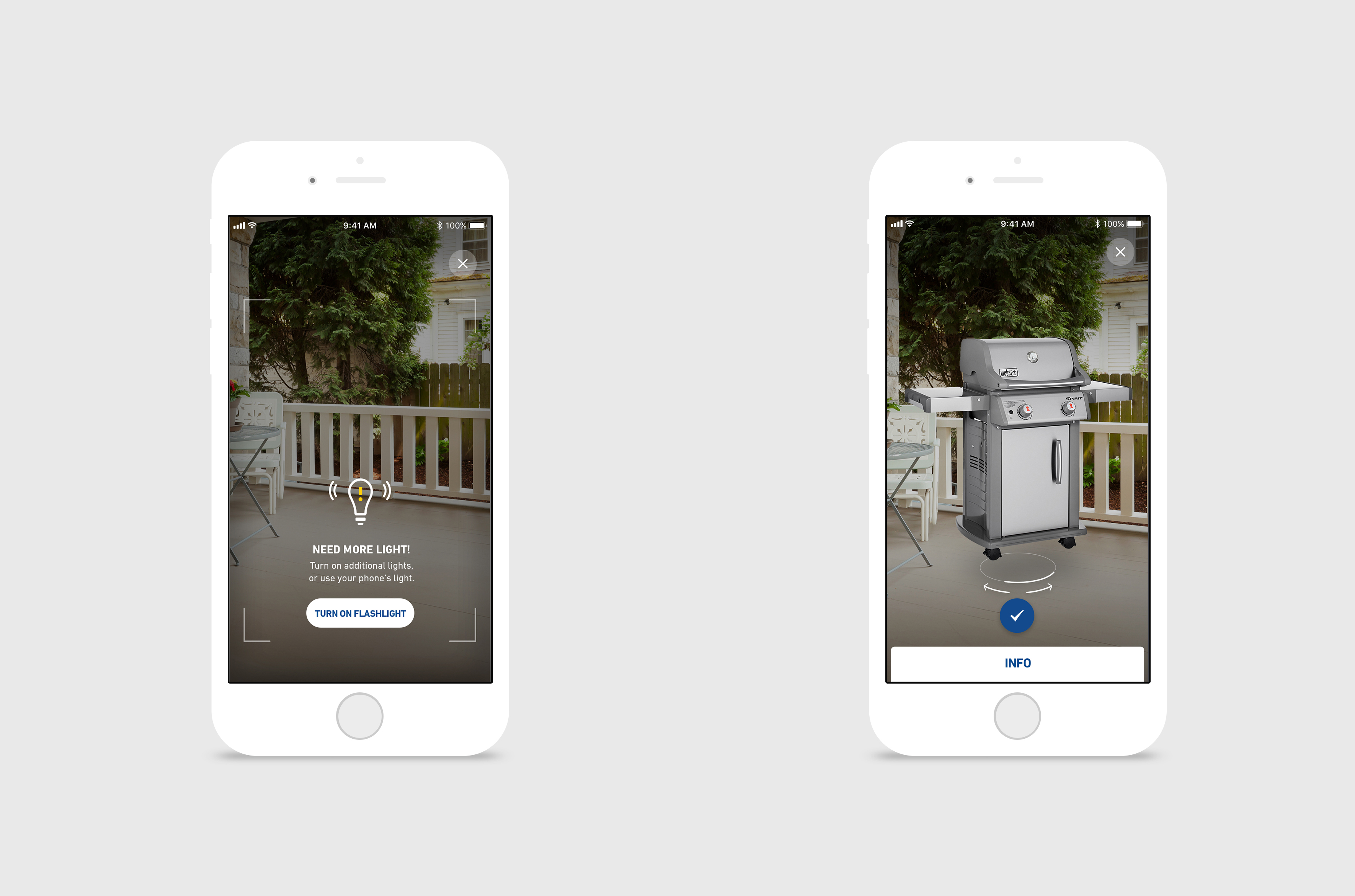
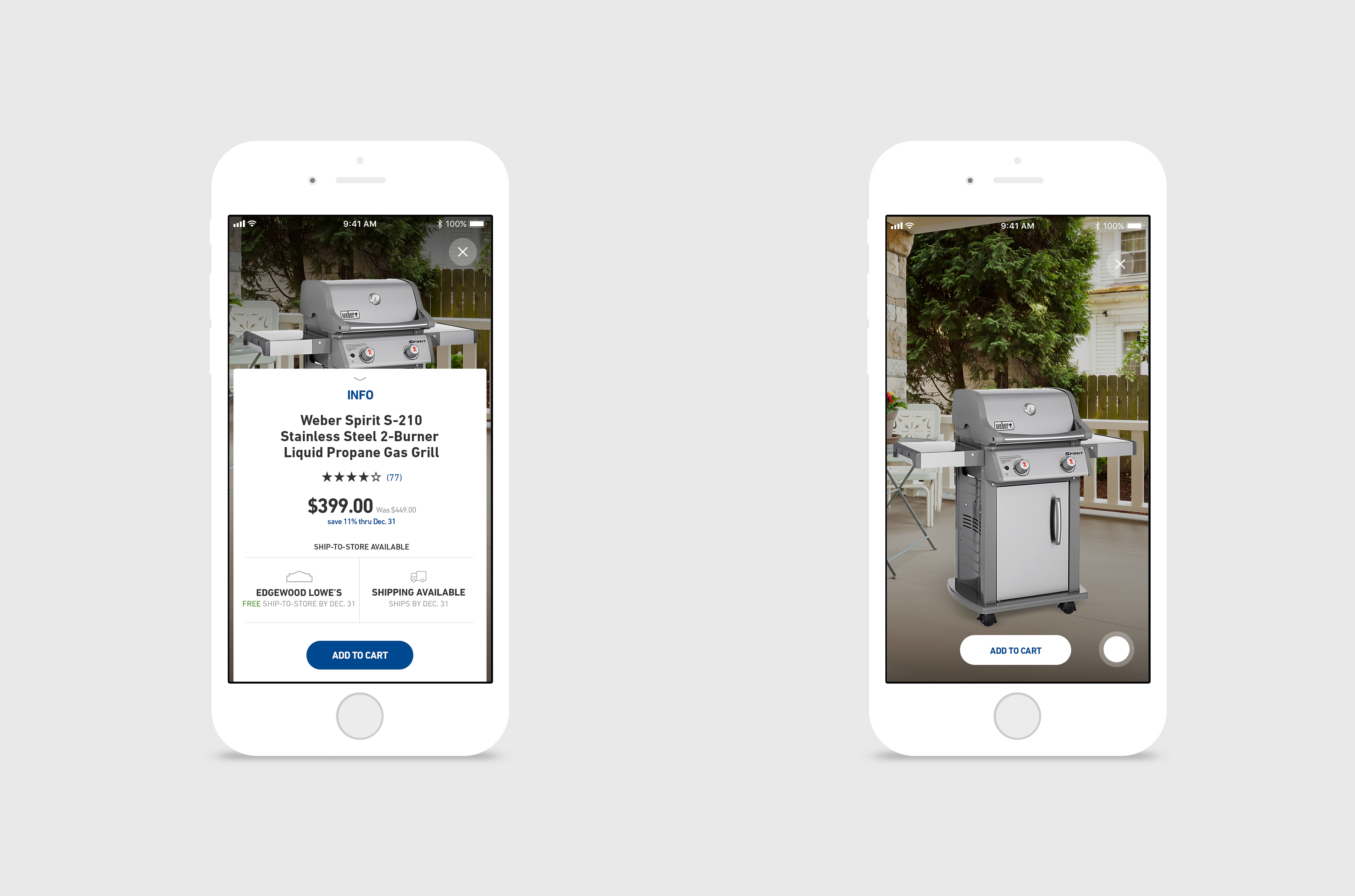
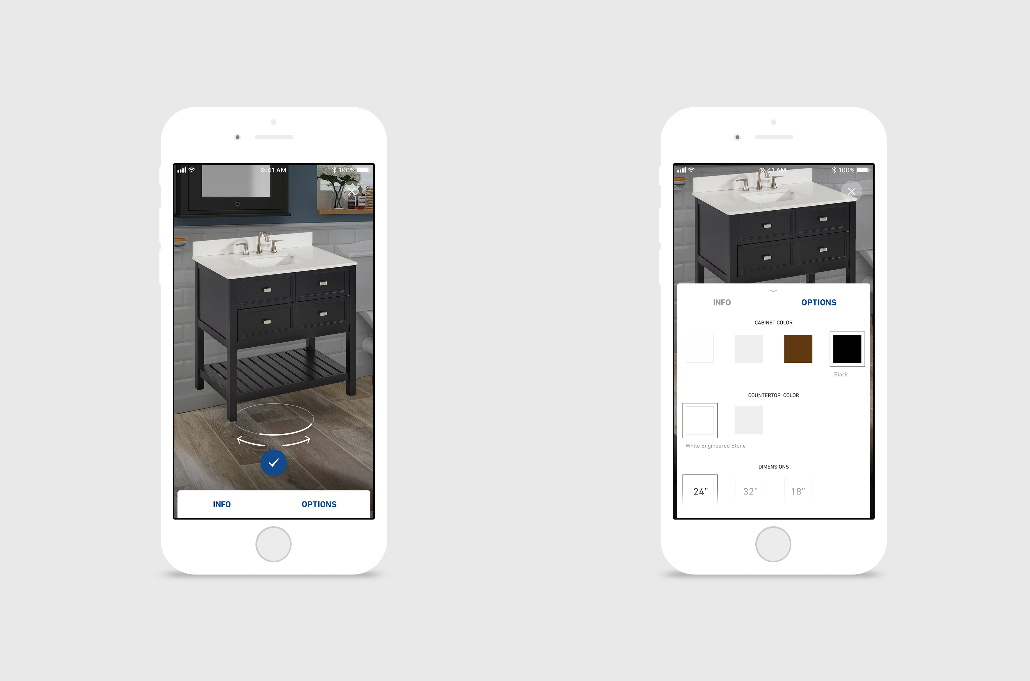
Final Comps
Team
UX: Mimi Kim
Visual Design: Jennifer Howard
Project Management: Ed McMillan, Jennifer Turner
